Did you know that your channel is more than just your stream? It’s true! Your channel is more than just the content you put on the screen. Just below the stream is the “About” section. DO NOT IGNORE THIS PART.
Think about it: your channel, and by extension your panels, will be viewed hundreds and thousands of times. You want to ensure that your channel provides all the relevant information your viewers need while also helping with your branding.
Today we’ll focus on the branding side of things and show you some fun and exciting ways you can infuse your personality into your panels. You can even combine some of the ideas that we present to have the perfect mix for your Twitch channel.
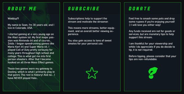
1. Text in the Panel Image
Source: Gladd
First on the list is a style that really took over the design space on Twitch panels. You can simply put in a panel image and have the text underneath it if you want. Or, you can put the text inside the panel image itself.
The negative of this is that you won’t be able to highlight the text because it’s just a picture. However, this will give you a lot of control over what you put in. You’ll be able to have everything fit your brand to your exact wants.
If you want to meticulously control every visual aspect, this is a great place to start.
2. Soft Edges
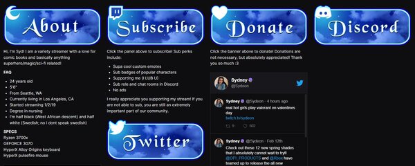
Source: Sydeon
Is your streaming room a designated cozy zone? Do you have “lofi hip hop radio – beats to relax/study to” on every second of the stream? Is one of your redeem rewards a head pat gif on the screen? Then you might want to try rounded corners for your panels.
We’re not going to get into an entire semester’s worth of design in psychology, so we’ll give you the basics. Rounder shapes are always going to be more friendly or cutesy.
If you want to have a more relaxed environment presented in your stream, you’ll want your panels that have the same type of vibe.
So, for the same reason anime characters have big round eyes, bust out the sandpaper and round those edges on your stream panels.
3. BRIGHT AND BOLD
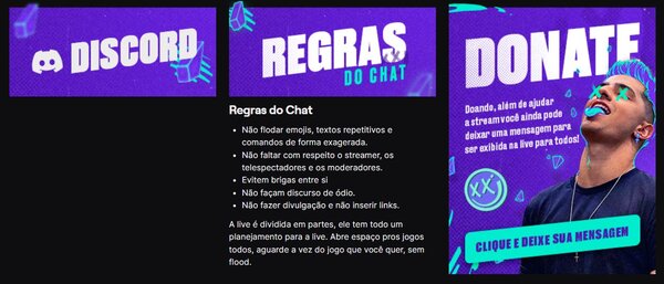
Source: loud_coringa
HEY! IS YOUR INNER VOICE READING THIS IN A LOUDER VOICE THAN NORMAL? DOES IT SOUND LIKE I’M YELLING AT YOU? BECAUSE I’M NOT.
I’M JUST USING ALL CAPS AS A WAY TO DRIVE HOME THE IDEA THAT BRIGHT AND BOLD MESSAGING IS AN EFFECTIVE WAY TO GET ATTENTION.
SO YOU MIGHT WANT TO CONSIDER USING BRIGHTLY COLORED, HIGH CONTRAST IMAGES FOR YOUR PANELS. YOU’LL BE SUPER MEMORABLE, AND IT’LL INCREASE YOUR LIKELIHOOD OF STANDING OUT AMONGST THE CROWD.
…I’M GONNA SWITCH TO A REGULAR VOICE NOW.
4. 3D
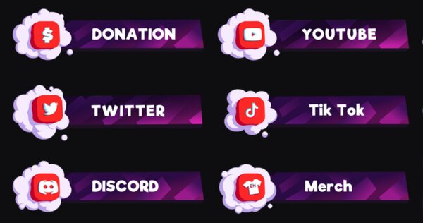
Source: NickEh30
Does anybody else remember Spy Kids 3-D? Remember how you had to go see it, because… Well, because it was in 3D? While it may seem like a cheesy special effect for movie theaters, giving your panels a visual pop is a great way to quite literally stand out.
By using a 3D effect on iconography in your panels, you’ll be able to naturally draw retention of the most critical bits of information (maybe we are doing a semester’s worth of design psychology).
So if you want to avoid looking flat on your Twitch channel, put on those red and blue plastic glasses and give 3D design a try.
5. Character
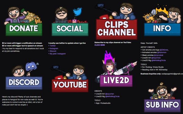
Source: sodapoppin
Do you know what you need more of on your channel? You. You need more of you on your channel. Or your mascot. Or your VTuber model.
People like looking at people, and one of the easiest ways to convey specific ideas, emotions, or thoughts in your iconography is to use a character in your panels.
People are very good at discerning the emotions present in somebody’s face. This gives you a lot of flexibility and room for creativity with your panel.
Not only will you tell them about your stream or about your sponsors, but you’ll also be able to literally put your face out there that much more for them. They’ll have that much better idea of what your channel is all about and the personality you are presenting on their screen.
If you’re stuck on what to put in your bio, check out these Twitch bio ideas for inspiration.
6. Flat/Minimalist

Source: deadmau5
Minimalism has existed as a design philosophy for decades. The idea of tossing aside unnecessary and extraneous things and distractions from your life has existed for thousands of years. Perhaps you want to say more by saying less. You can do that!
But you need to be careful. There’s a fine line between intentional, carefully thought out minimalism and simple laziness. Make sure that you are using your panels to their fullest extent if you’re going to use them as little as possible. Be efficient, clean, and professional.
7. Game Themed
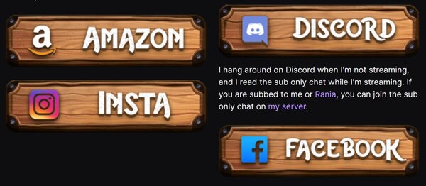
Source: nl_Kripp
Does anybody even play video games anymore? Like are games even a thing? What even is this “Twitch” of which you speak? Nah, just kidding. A great way to communicate the type of games you’re going to be playing on your Twitch channel is to integrate it into your panels.
If you like to play Fantasy games a lot, or perhaps you stream Dungeons & Dragons, you might go with something they can to a tavern’s sign. If you’re streaming competitive Super Smash Bros., you might use the Smash font and similar iconography to push home the idea (while also doing your best to not get sued by Nintendo).
If you are going to stream a specific game or type of game, extend that into your panels.
8. Artsy
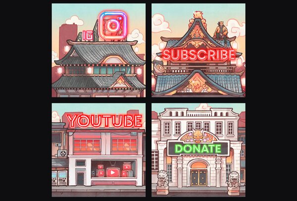
Source: buddha
I know I just made a joke about nobody gaming on Twitch, but hear me out. If you’re an artist on Twitch, you need to do the art for your panels. And that doesn’t just mean doing it like any other panel. You need to do your panels in your artwork.
You will give your users a perfect taste of what you are going to be producing on your channel. You’re going to let them know the colors you use. And let them know what kind of style you have. You’re going to grab them right from the get-go because they will want to see art like how it’s done in the panel’s happened in real-time.
9. Simple Uniformity
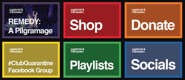
Source: gabrielanddresden
Don’t get this confused with minimalism. Simplicity as a core design element is using the quality of being simple. Minimalism is any design or style where the simplest and fewest elements are used to create the maximum effect.
It’s the difference between liking something simple because it’s simple and using something simple to say something grander (be sure you study for the final exam at the end of the semester).
With a uniform and straightforward design scheme, you’ll want to focus on being bold and brief with your images and what you write. It can feel constrictive, but your imagination can be unleashed of the constraints you give yourself.
10. Microsoft Paint (anti-tryhard)
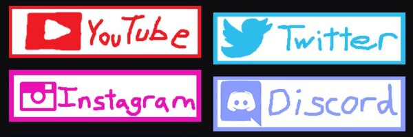
Source: PVPX
Personally speaking, I’m a massive fan of this one. I love the anti-try-hard “so bad it’s good” design philosophy. It shares a lot of the same dangers and potential pitfalls as minimalism. If you don’t do it right, it will come off as lazy.
In the words of Pablo Picasso: “Learn the rules like a pro, so you can break them like an artist.”
If you look at the example we’ve linked to this entry, you’ll notice the panels were clearly done in Microsoft Paint. However, whoever did it was extremely careful, trying to emulate the actual logos and pictures they were trying to replicate.
If they wanted to be that accurate, they could have just put the real thing there. But they didn’t and wasted all that time. Hilarious! Our brain will recognize all of that in an instant.
(Now, if you turn to page 394 in your textbooks, we’ll go over…)
11. Custom Text
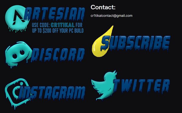
Source: moistcr1tikal
I like to also think of this design choice as “movie poster text.” All of the best movie posters have a special something to their font. Harry Potter has the lightning bolt on the “H” and “P,” Avengers has the whoosh on the A, etc.
By going with custom text, you’re pulling double duty. You’ll have a unique and exciting look to your panels, and you can use the lettering for iconography outside of Twitch on your social media. This can pay dividends in the long run if you decide to go with it.
12. Dark Theme
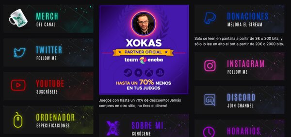
Source: elxokas
Does anybody actually use light mode? Dark mode and the surrounding aesthetic has become synonymous with gaming. It’s clean, iconic, and just fits with the culture of gaming and Twitch as a whole.
However, if you will use a dark mode style for your panels, try to make yourself stand out as much as possible. This is a trendy aesthetic for panels, and you don’t want to come off as generic.
13. The Classic, icon | text
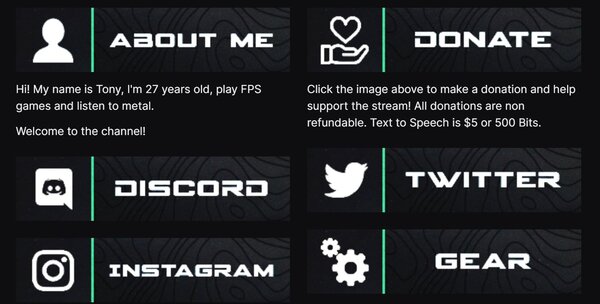
Source: LVNDMARK
There is something to be said for going with the most common option available. Because it has to be popular for a reason, and that is precisely what this style is. A simple design with the icon on the left and the word on the right is the most widely used and readily available option for you.
Suppose you can’t do the design yourself, or you don’t want to hire an artist. In that case, there will be hundreds and thousands of different pre-made assets available for you. Even if this doesn’t wind up being the panel design you use for the rest of your Twitch life, it’s a great place to start.
14. Lifestyle
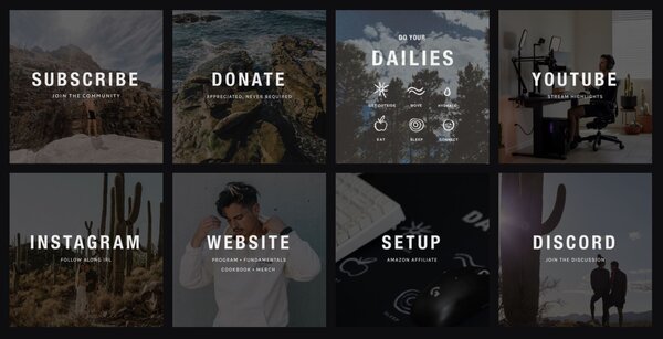
Source: Xaryu
“Lifestyle” doesn’t sound very descriptive for this design choice at first glance. But it actually is. Lifestyle panels are our way of extending your personality and your own life onto your channel. In this example that we’ve provided, he’s showing off his traveling, his fashion, his philosophy… He’s really giving you an inside look at his life.
Some people might think of this style as snooty or pretentious, but that’s not what this is about. It’s about really throwing yourself out there in your panel.
You are showing them yourself outside of Twitch. You’re giving them a look behind the curtain, so to speak. So bust out the camera and turn up the image transparency. It’s time to show them what you’re made of!
15. Transparent (no background)
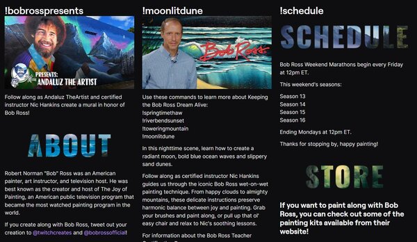
Source: BobRoss
This is a really cool effect you don’t see very often compared to some of the other design choices. Using a transparent background in your panel emphasizes what is there because of how much nothing there is. This uses the negative space to its fullest and pulls the panel out off the screen.
And while this might seem like a difficult thing to do, you can pull this off with basic knowledge of Photoshop or GIMP. So if you want to try your hand at design and go with something fun and unique, give this a shot!
When you’ve got a good idea for what type of panels you want, head over to Fiverr to get someone to design them for you!
